
Rating Every Cassiopeia Skin Through an Illustrator’s Eye
She's had great art and not so great art.

I am a Cassiopeia main on League of Legends. I will be ranking her skins based on color palette, silhouette, shape value, etc. I am an illustrator with 15+ years of experience. I also have a B.A. in studio art with a minor in biology! I will be assigning a letter grade to each Cassiopeia skin with my overall impression of the skin. I will be ignoring chroma variations of the skin since that would immediately add more complexity to this ranking system.
I will give the title of the skin, followed by a rank (letter grade) and a brief explanation for why I graded it as such. These are my personal opinions on her skins. Remember, she’s a fictional character in a fictional game. You are welcome to disagree with me.
Base Skin: C-
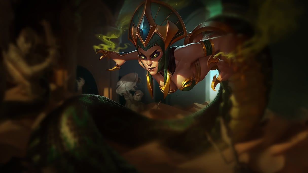
Color Palette: A+
Silhouette: D
Model Readability: B
Theme Execution: B-
Splash Art Design: A
Final Thoughts:
The splash art for this skin is gorgeous. However, the in-game model is slightly terrifying in the wrong way. Cassiopeia reads as extremely top-heavy in-game. I understand why she’s designed this way (given the Ancient Egyptian inspired headwear), but it ultimately feels blocky in my opinion when viewing the model on the map.
Her eyes, when viewed on the in-game model, read more like an alien from the Warhammer 40k universe rather than snake eyes. I know some people like this eye effect on the model. However, it’s just not for me. That said, the color palette is immaculate across both the splash art and the in-game model.
Desperada: D
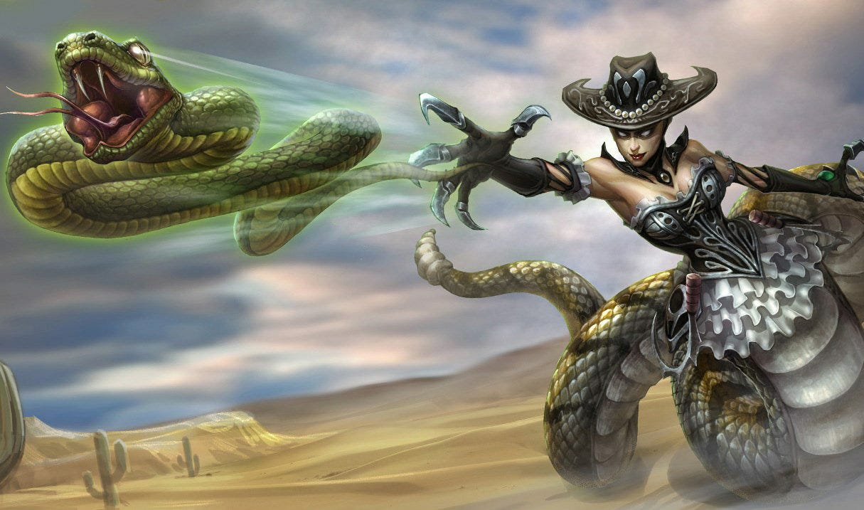
Color Palette: D
Silhouette: D
Model Readability: C-
Theme Execution: C
Splash Art Design: D
Final Thoughts:
Desperada released in 2010. The High Noon skin line did not debut until 2011 (with Twisted Fate), and I view Desperada as a kind of “prototype High Noon” skin.
In-game, her model features a deep navy blue corset, a white ruffled skirt, and what appears to be a heavily saturated rattlesnake tail pattern. The hat reads as a very dark grey. These colors are markedly different from what is presented in the splash art, creating a noticeable visual disconnect.
I understand that this skin is one of many that suffers from League’s early illustration era and is in desperate need of an update or full visual overhaul (looking at you, Commando Lux). Honestly, I would rather see this skin retired entirely and replaced with a proper High Noon Cassiopeia.
I can tell the intent was a “high-end, proper Western lady” aesthetic, but the execution across the model, splash art, and overall design simply does not land for me.
Siren: B+
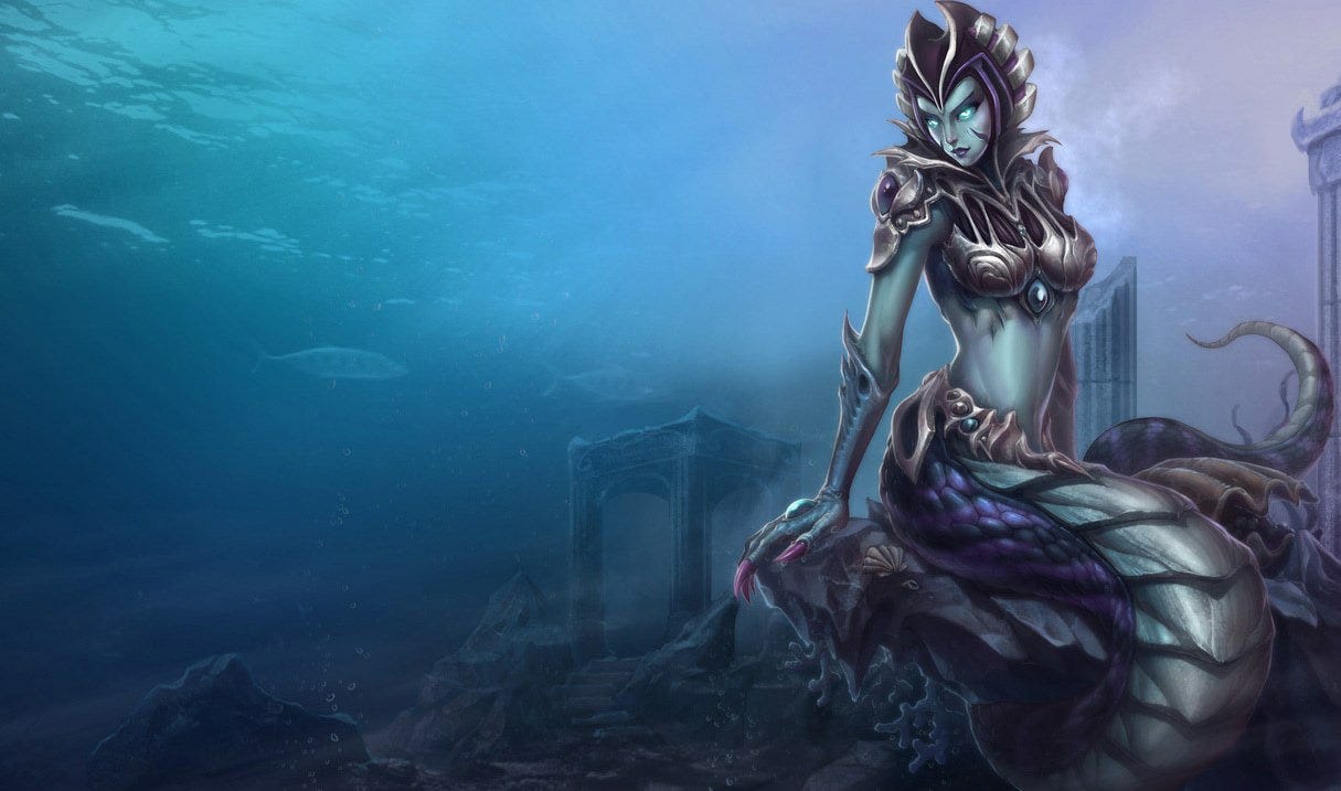
Color Palette: A
Silhouette: B
Model Readability: B-
Theme Execution: A
Splash Art Design: A
Final Thoughts:
Siren Cassiopeia is the skin that originally made me fall in love with this champion. It released back in 2010, and, like many skins from that era (and before), the in-game model has not aged particularly well.
I do love the overall color palette across both the model and splash art. It successfully evokes the feeling of a terrifying ancient sea monster mistress. The thematic concept is strong, and I think Riot absolutely nailed the idea of a scary deep-sea creature.
That said, the model once again suffers from a clunky, top-heavy feel due to the headdress. Because of this, I almost never choose this skin anymore when I play Cassiopeia. It’s one of those skins I look back on fondly through nostalgia-tinted glasses but rarely reach for in actual gameplay.
Mythic: C+
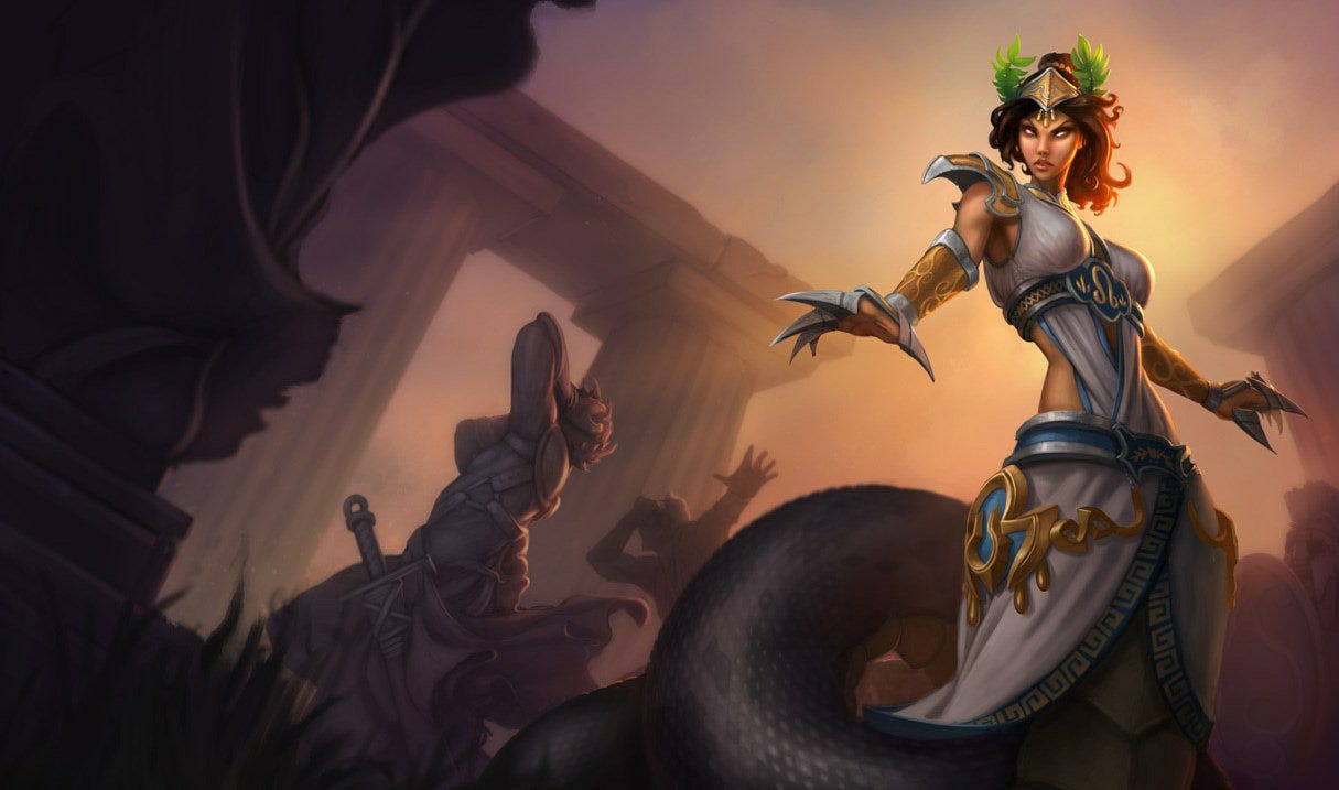
Color Palette: B+
Silhouette: B-
Model Readability: C+
Theme Execution: C+
Splash Art Design: C
Final Thoughts:
Mythic Cassiopeia debuted in 2012, and unfortunately, it shows. I appreciate that Riot leaned into a more traditional Greek Gorgon inspired design (think Medusa and here sisters), but overall the model has not aged particularly well.
The color palette works reasonably well, relying on muted, forest-toned colors that feel appropriate for the theme. Beyond that, however, much of the design reads as mediocre. The tail in particular feels generic - both in shape and detailing - and includes a seemingly random black ring followed by a short section of tail, which feels like a random detail to break up the continuity of her tail.
As a result, this skin ends up feeling largely forgettable.
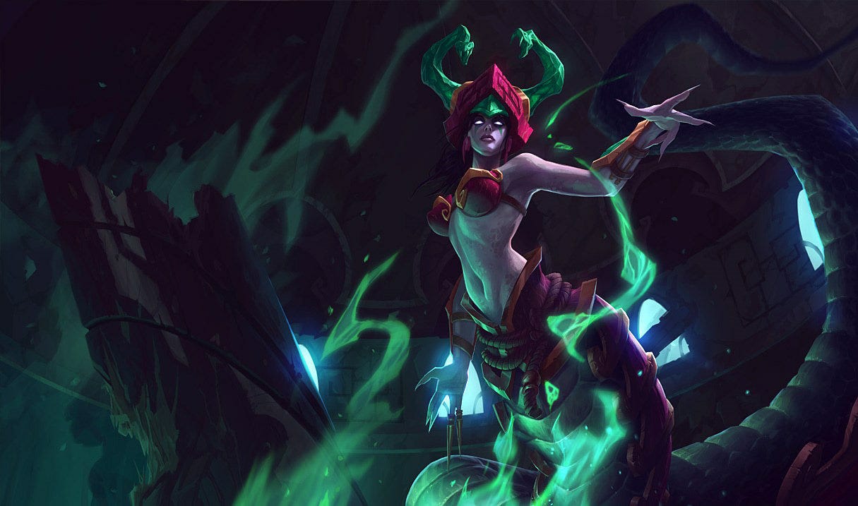
Jade Fang: B-
Color Palette: B+
Silhouette: C+
Model Readability: B-
Theme Execution: B
Splash Art Design: B-
Final Thoughts:
Jade Fang is clearly inspired by a more generalized Southeast Asian aesthetic, leaning particularly into elements associated with Chinese folklore. The color palette across both the splash art and model works well, making strong use of complementary reds and greens.
However, the model becomes visually strange due to what appear to be semi-transparent, buck deer like green horns protruding from the back of her skull. While I find the tail absolutely gorgeous (featuring deeply saturated dark greens paired with rich maroon reds) the horns are the single largest deterrent for me.
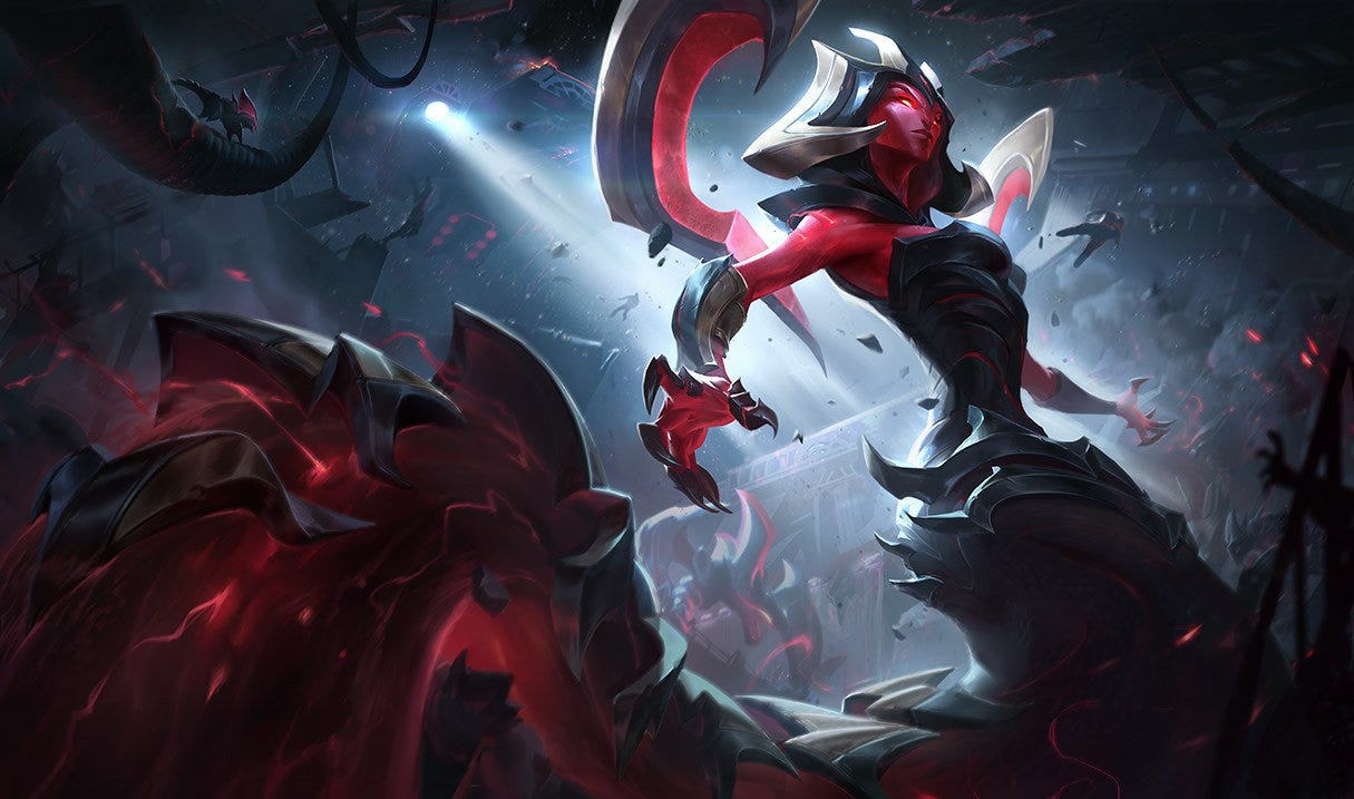
Eternum: B-
Color Palette: B
Silhouette: B-
Model Readability: C+
Theme Execution: B
Splash Art Design: B-
Final Thoughts:
I am not personally a fan of sci-fi skins that lean heavily into space or alien aesthetics, it is a genre niche that just is not for me. That said, I can still appreciate the ideas Riot was exploring with Cassiopeia here, and I can easily see how someone who genuinely loves xenomorphic sci-fi horror aliens would enjoy this skin.
The reds and blacks work well together across both the splash art and in-game model. However, there is a faint red shimmer that runs along her tail and emits a constant red aura during gameplay. I would personally find this effect distracting. Still, I understand the “evil serpent alien queen” vibe they were aiming for with this design.
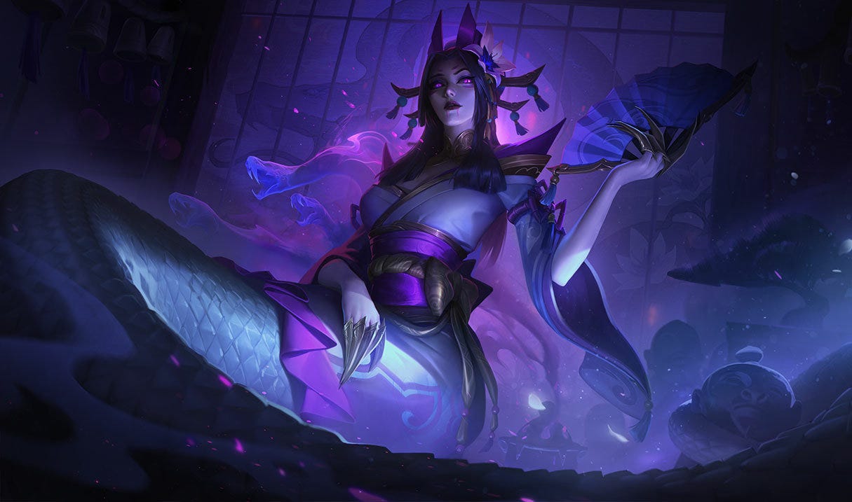
Spirit Blossom: A
Color Palette: A
Silhouette: A-
Model Readability: A-
Theme Execution: A
Splash Art Design: A
Final Thoughts:
Spirit Blossom Cassiopeia is one of my favorite skins for the champion. I adore the beautiful kimono-inspired design for her top, as well as the fan she twirls during her recall animation. This is one of the two skins I consistently rotate between when playing our lovely serpent queen.
No notes. Everything about this skin works exceedingly well.
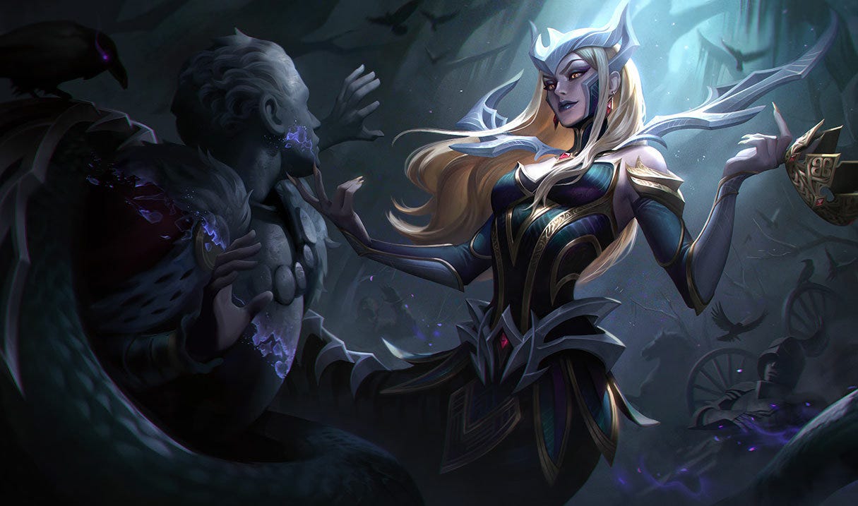
Coven: A
Color Palette: A-
Silhouette: A
Model Readability: A
Theme Execution: A
Splash Art Design: A-
Final Thoughts:
Coven Cassiopeia is my other favorite skin for the serpent queen. I absolutely adore the Coven skin line in League, and I think nearly everything about this skin works exceptionally well.
My only real nitpick is her hair color. I personally wish she was not blonde for this skin - the blonde stands out just a bit too much for my taste - but I understand the choice. Aside from that, I absolutely adore this skin.
Bewitching: B+
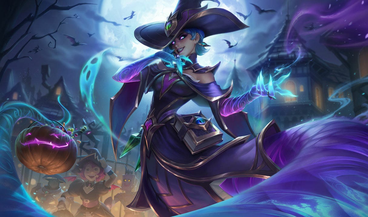
Color Palette: A
Silhouette: B+
Model Readability: A
Theme Execution: B+
Splash Art Design: A-
Final Thoughts:
The Bewitching skin line in League is hit or miss for me. Some entries lean too hard into the “cheese” factor, while others land more elegantly within an almost parody-style Halloween fantasy. Overall, I feel Cassiopeia strikes a solid balance between playful Halloween witch and genuinely spooky.
The purples and blues work well together across both the model and splash art. I also appreciate the inclusion of a grimoire (witch’s spellbook) attached at her waist. I’m personally not a fan of the oversized hat, though I understand why it’s present in the design.
The semi-transparent tail is easily the biggest selling point of this model and adds a lot of visual interest.
Prestige MythMaker: A
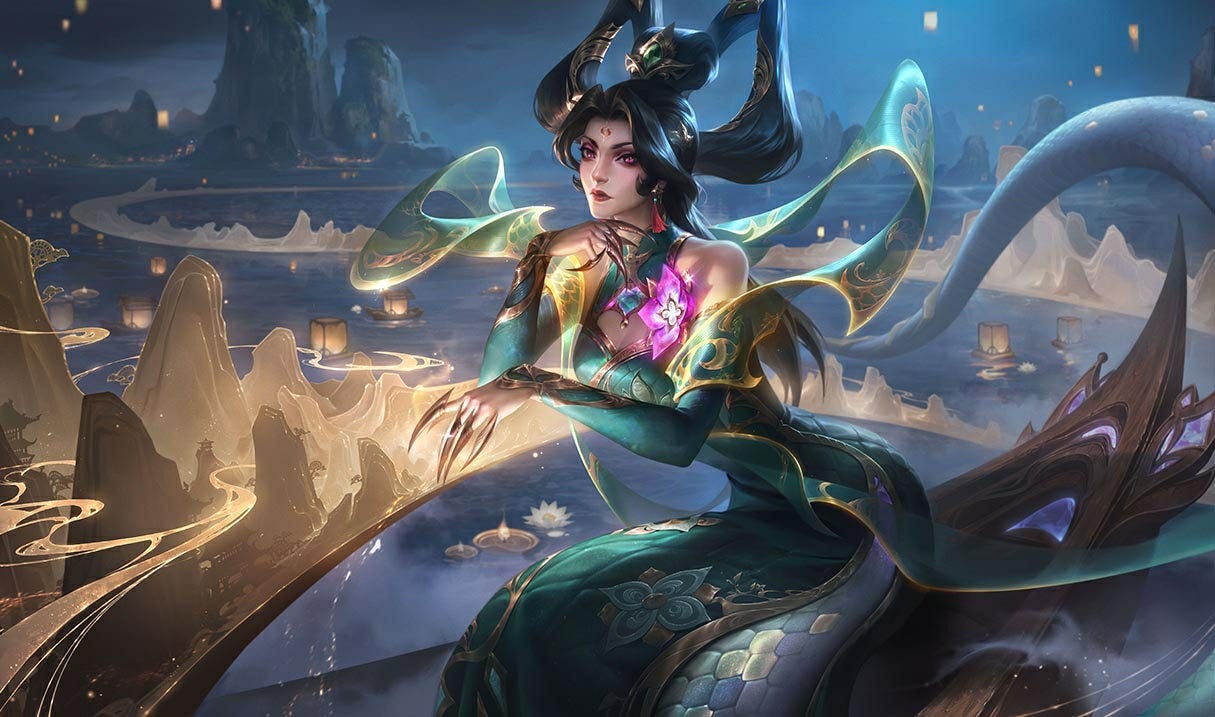
Color Palette: A
Silhouette: A
Model Readability: A-
Theme Execution: A-
Splash Art Design: A-
Final Thoughts:
I love Prestige Cassiopeia. My two main critiques are that the skin was only available for a limited time, and that the silver accent at the end of her tail stands out quite harshly on the in-game model.
I understand this design is inspired by a specific era of Chinese history. However, I am not knowledgeable enough about that historical period to confidently critique how accurately the skin captures its cultural inspiration, so I won’t attempt to evaluate it on that front.
Disclaimer:
This article was written entirely by me. I drafted it in a bullet journal, transferred my notes into Google Keep, and edited it manually. No generative AI tools were used at any stage.
I find most of her skins are incredibly ugly in game but I adore her as a champion. I'm curious what a redesign would look like and if riot would ever do it. Her kit is so interesting and is a fun champion to play with how stimulating she is. Appreciate the review looking forward to reading more